
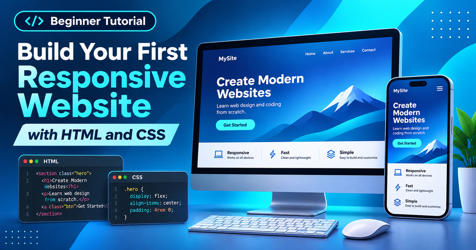
You can build a responsive website without frameworks or JavaScript. This beginner project creates Northstar Notes, a fictional landing page with working navigation, a headline, a button, and three feature cards. You will create two files, style the layout, test phone widths, and troubleshoot mistakes. The result is a working webpage, not an actual productivity service.
What You Will Build
HTML defines a page’s content and structure; CSS determines its appearance. Your browser combines them. We will start with narrow-screen styling, then add a breakpoint for wider displays. The example includes section links, flexible typography, stacked cards, and a keyboard-accessible skip link. It needs no external fonts, libraries, or accounts.
Step 1: Install Visual Studio Code
Download Visual Studio Code from its official website and install the appropriate Windows, macOS, or Linux version. VS Code edits files; your browser displays them. Extensions are optional for this project.
Create a folder named northstar-site. In VS Code, choose File > Open Folder and select it. Create exactly two files:
northstar-site/
  index.html
  styles.css
The names must match the code below. Keep the files together; an accidental filename such as styles.css.txt prevents the stylesheet from loading correctly.
Step 2: Create the HTML Page
Open index.html, paste this complete code, and save. The head holds browser information, including the page title and mobile viewport setting. The body contains visible content.
<!doctype html>
<html lang="en">
<head>
<meta charset="UTF-8">
<meta name="viewport" content="width=device-width, initial-scale=1">
<meta name="description" content="A simple responsive landing page built with HTML and CSS.">
<title>Northstar Notes | Find Your Focus</title>
<link rel="stylesheet" href="styles.css">
</head>
<body>
<a class="skip-link" href="#main">Skip to content</a>
<header class="site-header">
<div class="container header-inner">
<a class="logo" href="#top">Northstar<span>.</span></a>
<nav aria-label="Main navigation">
<a href="#features">Features</a>
<a href="#about">About</a>
</nav>
</div>
</header>
<main id="main">
<section class="hero container" id="top">
<p class="eyebrow">SIMPLE IDEAS, CLEAR DAYS</p>
<h1>Make room for what matters.</h1>
<p class="intro">Northstar Notes is a concept for organizing your ideas without the clutter. Explore this sample page to see responsive design in action.</p>
<a class="button" href="#features">Explore features</a>
</section>
<section class="features container" id="features" aria-labelledby="features-heading">
<h2 id="features-heading">Small tools, big clarity</h2>
<div class="card-grid">
<article class="card">
<span class="symbol" aria-hidden="true">✓</span>
<h3>Capture ideas</h3>
<p>Keep important thoughts together in one place.</p>
</article>
<article class="card">
<span class="symbol" aria-hidden="true">★</span>
<h3>Choose priorities</h3>
<p>Give the next useful action your attention.</p>
</article>
<article class="card">
<span class="symbol" aria-hidden="true">☼</span>
<h3>Find balance</h3>
<p>Create a calmer starting point for your day.</p>
</article>
</div>
</section>
<section class="about container" id="about">
<h2>A practice project, not a working app</h2>
<p>This demonstration teaches page structure and layout. Its cards describe imaginary features; no accounts or notes are stored.</p>
</section>
</main>
<footer class="site-footer">
<div class="container">
<p>Northstar Notes — an HTML and CSS learning project.</p>
</div>
</footer>
</body>
</html>The semantic header, main, section, article, and footer elements help describe the document. Navigation targets such as #features match actual section IDs. The button links to another section instead of claiming to perform an action it cannot perform. The descriptions represent fictional features, not implemented functionality.
Step 3: Connect and Add CSS
The HTML line <link rel="stylesheet" href="styles.css"> connects the files. Paste the following rules into styles.css and save. A class selector such as .card styles all elements with that class. padding adds space inside a box; margin adds space outside it.
* {
  box-sizing: border-box;
}
html {
  scroll-behavior: smooth;
}
body {
  margin: 0;
  font-family: system-ui, sans-serif;
  color: #14213d;
  background: #f8fafc;
  line-height: 1.6;
}
a {
  color: inherit;
}
a:focus-visible {
  outline: 3px solid #f59e0b;
  outline-offset: 3px;
}
.container {
  width: 92%;
  max-width: 1080px;
  margin-inline: auto;
}
.skip-link {
  position: absolute;
  top: -5rem;
  left: 1rem;
  padding: .5rem;
  background: white;
  z-index: 10;
}
.skip-link:focus {
  top: 1rem;
}
.site-header {
  background: white;
  border-bottom: 1px solid #e2e8f0;
}
.header-inner {
  display: flex;
  align-items: center;
  justify-content: space-between;
  flex-wrap: wrap;
  gap: 1rem;
  padding-block: 1rem;
}
.logo {
  text-decoration: none;
  font-size: 1.35rem;
  font-weight: 800;
}
.logo span {
  color: #1d4ed8;
}
nav {
  display: flex;
  gap: 1.25rem;
}
nav a {
  text-decoration: none;
  font-weight: 600;
}
nav a:hover {
  text-decoration: underline;
}
.hero {
  padding-block: 5rem;
}
.eyebrow {
  color: #1d4ed8;
  font-size: .8rem;
  font-weight: 700;
  letter-spacing: .12em;
}
.hero h1 {
  max-width: 12ch;
  margin: .5rem 0 1rem;
  font-size: clamp(2.2rem, 7vw, 4rem);
  line-height: 1.15;
}
.intro {
  max-width: 42rem;
  color: #475569;
  font-size: 1.125rem;
}
.button {
  display: inline-block;
  margin-top: 1rem;
  padding: .8rem 1.2rem;
  border-radius: .7rem;
  background: #1d4ed8;
  color: white;
  text-decoration: none;
  font-weight: 700;
}
.button:hover {
  background: #1e40af;
}
.features {
  padding-bottom: 4rem;
}
.features h2, .about h2 {
  font-size: 1.8rem;
  line-height: 1.2;
}
.card-grid {
  display: grid;
  gap: 1rem;
}
.card {
  padding: 1.5rem;
  border: 1px solid #e2e8f0;
  border-radius: 1rem;
  background: white;
  box-shadow: 0 8px 24px rgba(15, 23, 42, .04);
}
.symbol {
  color: #1d4ed8;
  font-size: 1.5rem;
}
.card h3 {
  margin: .5rem 0;
}
.card p, .about p {
  color: #475569;
}
.card p {
  margin: 0;
}
.about {
  padding: 2rem 0 4rem;
  border-top: 1px solid #e2e8f0;
}
.about p {
  max-width: 42rem;
}
.site-footer {
  padding-block: 1.5rem;
  border-top: 1px solid #e2e8f0;
  color: #475569;
}
@media (min-width: 760px) {
  .card-grid {
    grid-template-columns: repeat(3, minmax(0, 1fr));
  }
  .hero {
    padding-block: 7rem;
  }
}
@media (prefers-reduced-motion: reduce) {
  html {
    scroll-behavior: auto;
  }
}
The .container uses a percentage width to preserve mobile margins and a maximum width to improve desktop readability. box-sizing: border-box makes element dimensions more predictable. clamp() limits headline size while allowing it to adapt to screen width. The blue button and cards are styled with ordinary CSS, not images.
Step 4: Make the Layout Responsive
Below 760 CSS pixels, the Grid cards appear in one column. The @media (min-width: 760px) rule changes them to three columns and increases hero spacing on wider displays. This is mobile-first design: small-screen rules come first, and larger-screen rules override only what changes.
Breakpoints describe when content needs a new arrangement, not a specific phone model. The header uses display: flex and flex-wrap: wrap, so its items can wrap independently of the Grid breakpoint. Try changing 760px to 850px; resize the browser and watch when the cards shift.
Avoid setting a fixed width on the entire page. Oversized elements can cause horizontal scrolling on phones. The viewport metadata also matters: without it, some mobile browsers present a desktop-sized layout scaled down to fit.
Step 5: Preview Your Website
Find index.html in the folder and double-click it to open it in a browser. After making edits, save both files and refresh the tab. The local address may begin with file:///; this is not a public hosting URL.
Click Explore features to jump to the cards and About to reach the final section. Press Tab to move through links and check their visible focus outlines. Keyboard users can reveal the Skip to content link and jump directly into the main page.
Step 6: Check Mobile Sizes and Troubleshoot
Open Chrome Developer Tools and toggle the device toolbar. In Responsive mode, try widths of 320, 375, 760, and 1280 pixels. At narrow widths, the cards should stack; at wider widths, they should align across the page. Check text readability, navigation, and unexpected horizontal scrolling.
| Symptom | Likely cause | Fix |
|---|---|---|
| Missing design | Incorrect stylesheet path | Match href and filename. |
| Tiny mobile layout | Missing viewport metadata | Restore the viewport tag. |
| Old design remains | Unsaved file or cached page | Save and refresh. |
| Sideways scrolling | An oversized element | Inspect widths and overflow. |
| Dead navigation | Mismatched section IDs | Check each link target. |
The browser’s Console and Network panels can help reveal loading problems. Device emulation tests layout dimensions, but cannot reproduce every real-device behavior. If possible, also inspect the finished page on an actual phone, especially after customizing text or adding images.
Customize Your First Project
Replace the sample branding, rewrite the three cards, or add a section with its own ID and navigation link. Change one CSS property at a time, refresh, and compare the result. This reveals which rules control spacing, width, typography, and color.
The example remains intentionally static: it has no database, user login, or working note editor. A public URL requires separate static hosting. Keeping these limits clear prevents readers from confusing a finished layout with a complete web application.
Frequently Asked Questions
Do I need JavaScript?
No. HTML and CSS handle this static page. Interactive features such as saving notes would require additional technology.
Why use separate HTML and CSS files?
An external stylesheet keeps design rules organized and can be reused across multiple pages. File paths must match exactly.
Does responsive mean every device is guaranteed to look perfect?
No. New text, images, and browser differences can change a layout. Test several widths and real devices when possible.
Can I publish this for free?
Some static hosting providers offer free plans, subject to changing limits. This project can be hosted as two ordinary files without a server-side application.
Conclusion
You now have a complete two-file website with structured HTML, linked CSS, keyboard-friendly navigation, and a responsive card layout. Save a copy, personalize a section, and test again at phone and desktop widths. Understanding your edits is more valuable than memorizing code.